
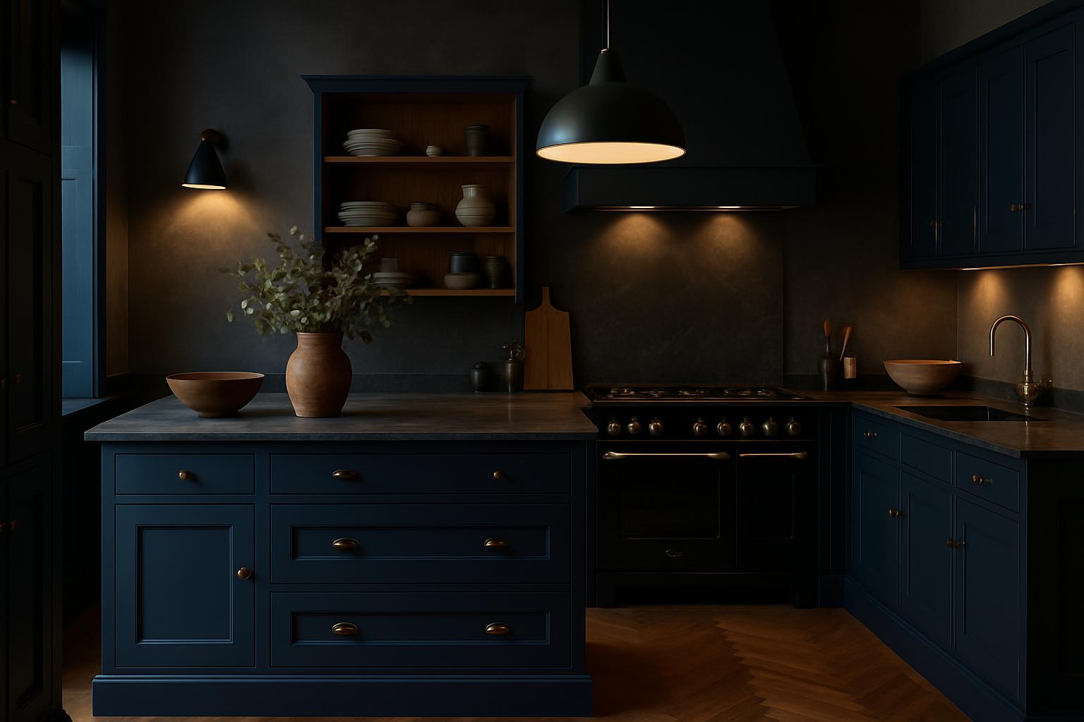
Two-Tone Kitchen Ideas: How to Mix Colours Without It Looking Wrong
Most people get this wrong: mixing kitchen colours isn’t about using all your favourites. It’s about creating contrast and balance. Two-tone kitchen colour ideas in the UK are a brilliant way to personalise your space, but you need to do it right. The most reliable method is to keep upper cabinets lighter and lower ones darker. This approach draws the eye upwards and makes the space feel larger.
When you’re considering two-tone kitchen colour ideas, it’s best to limit yourself to two colours. More than that and it starts to look indecisive rather than intentional. You want your kitchen to feel curated, not chaotic. An island in a contrast colour can add interest, but don’t go overboard. The idea is to create a focal point, not a distraction.
Choosing the right colours is crucial. A soft white or light grey paired with navy or deep green is a safe bet. It’s classic and sophisticated, especially if you’re aiming for a timeless look. If you’re after something more contemporary, consider charcoal with blush tones. It’s a bit daring, but when done right, it makes a statement.
Two-tone kitchen colour ideas work best when they feel deliberate. This means considering the whole room. Your wall colour, flooring, and appliances should complement your cabinet choices. It’s not complicated, but it does require a bit of thought. In my experience, coordinating with existing elements is where most people trip up. If you’re unsure, have a look at some professional spaces, perhaps at our kitchen showrooms in Gerrards Cross, for inspiration.
Another tip is to take a cue from nature. Earthy tones like terracotta and sage work brilliantly together. They’re subtle and calming, perfect for a family kitchen. For a bit more drama, you can look to industrial styles. Pairing black with wood tones is bold but offers a warm, inviting feel that’s both modern and classic.
Of course, lighting plays a huge role in how colours appear. Natural light will make colours pop, while artificial lighting might dull them down. Visit our kitchen showrooms in Bristol to see how different lighting affects colour. It’s worth knowing this before you commit to a colour scheme.
If you’re feeling adventurous, consider the impact of texture as well. Matt finishes absorb light and can make colours appear deeper, while gloss finishes reflect light and can brighten up darker shades. It’s all about balance. Use gloss finishes sparingly if you have bold colours to avoid them overpowering the space. You might find a browse through Houzz helpful for some visual examples and ideas.
In the end, the goal is to create a kitchen that feels cohesive and intentional. A two-tone scheme is an excellent way to add depth and interest without overwhelming the space. For more ideas and a hands-on look, why not explore our kitchen showrooms in Doncaster? Seeing how colours work together in person can make all the difference.
How do I choose the right colours for my two-tone kitchen?
Stick to two colours for balance. Consider light upper cabinets and darker lower ones for a classic look.
Can I use more than two colours?
It’s possible, but it often looks busy. Two colours create a more deliberate, cohesive feel.
What if my kitchen doesn’t get much natural light?
Opt for lighter colours to keep the space bright. Matt finishes can also help, as they won’t reflect artificial light as much.
How can I test colours before committing?
Paint samples or visit showrooms to see how lighting affects colours. Our kitchen showrooms offer great examples.
For more advice and to see examples of two-tone kitchens, visit our kitchen showrooms in Gerrards Cross.